

- Details
- Written by Super User
- Category: Features
Certified organic hotel, fresh food from 100% organic farms, “Gruene Haube” award for organic cuisine. Relax in our hay baths with organic hay, aromatherapy bath, rock salt sauna, garden.


- Details
- Written by Super User
- Category: Features
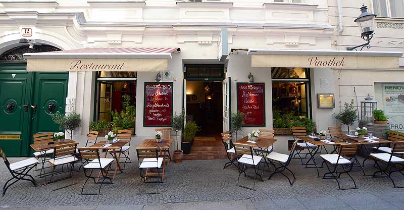
Weinbotschaft Wien
Annagasse 12, 1010 Vienna
- Weinbotschaft Wien is a 100% organic restaurant in Vienna. From the appetizers to the homemade pasta to the wine, every ingredient is certified organic by Austria Bio Garantie. This cozy restaurant is a popular spot, so be sure to make a reservation!
Feldberg
Westbahnstraße 21, 1070 Vienna
Feldberg is an organic restaurant in Vienna that is open for lunch on weekdays and dinner on Wednesday and Thursday. The menu at Feldberg changes daily, but you can count on finding delicious meals with fresh, organic ingredients, including vegan and lactose-free options. Feldberg's brunch on Saturday and Sunday with freshly-baked bread, unique jams, cakes, muffins, fresh fruit, yogurt, and waffles is also popular.
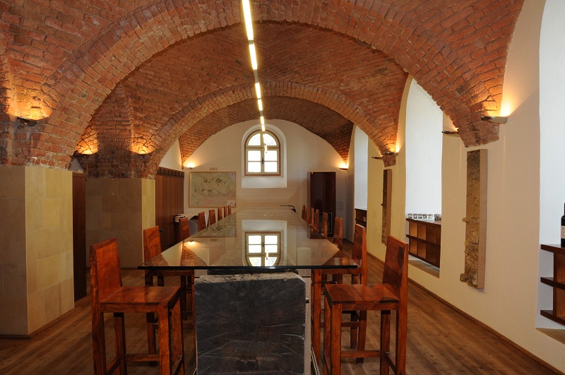
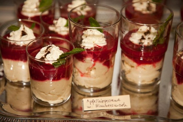
Weingut Hajszan Neumann
Grinzingerstraße 86, 1190 Vienna
The Weingut Hajszan Neumann is a vineyard in Vienna that produces biodynamic wines. Whether you drink red, white, or rose wine, you can count on the fact that the wine is certified organic by Austria Bio Garantie. The vineyard's restaurant also uses certified organic eggs, dairy, grains, and other ingredients in its delicious dishes, which range from organic pan-fried trout to rump steak. You should of course enjoy a glass of biodynamic wine with your meal!

- Details
- Written by Super User
- Category: Features
This Premium Template is powered by the marvelous Bootstrap framework. It utilizes a a 12-column responsive grid system, making for a 940px wide container without responsive features enabled. Also we have enabled by default the responsive feature (you may disable through the template parameters) and your website will looks great across all devices like Wide Monitors, Tablets and Mobile Phones.
With the responsive feature enabled, the grid adapts to be 724px and 1170px wide depending on your viewport. Below 767px viewports, the columns become fluid and stack vertically.
You may learn more on the Bootstrap Scaffolding page about the Grid System
On the other hand you may use the style1 and style2 module class suffixes to change the colors of the sidebar module positions, as you are seeing here on this page. Don't know how to add a module class suffix? You may View here the solution
Would you like to view each module position more in detail and to learn it's name? Go to Module Positions page
You can move the Sidebar from left to right and vice-versa. This can be easily done from the template parameters
Lorem ipsum dolor sit amet, consectetur adipiscing elit. Quisque vitae leo eu risus eleifend laoreet vel ut massa. Vestibulum eget ante vel dui varius hendrerit. In rutrum tellus vitae ullamcorper mollis. Duis venenatis sem et elit lacinia, in sollicitudin libero dapibus. Etiam ut magna pharetra urna aliquet porta.
Aenean ligula libero, tincidunt nec felis non, rhoncus varius erat. Curabitur vitae arcu pharetra, gravida libero vel, viverra odio. Proin semper augue at faucibus tempus. Pellentesque fermentum dolor in libero laoreet, in sodales sem viverra.
Class aptent taciti sociosqu ad litora torquent per conubia nostra, per inceptos himenaeos. Pellentesque libero turpis, placerat non risus eget, tempus rutrum nisl. Curabitur ultrices aliquet ligula, sit amet mollis enim viverra in. Curabitur elementum purus sapien, ut varius urna dignissim nec. Nulla id dictum tortor, vitae venenatis eros.
Qatar Airways Fliegen Sie in der besten Business
Heelijke Huisjes Hideaways
Travel Bags